
Ready. Set. Picnic.
Brand Development · Website Design · Photo + Video · Wichita and South Central Kansas
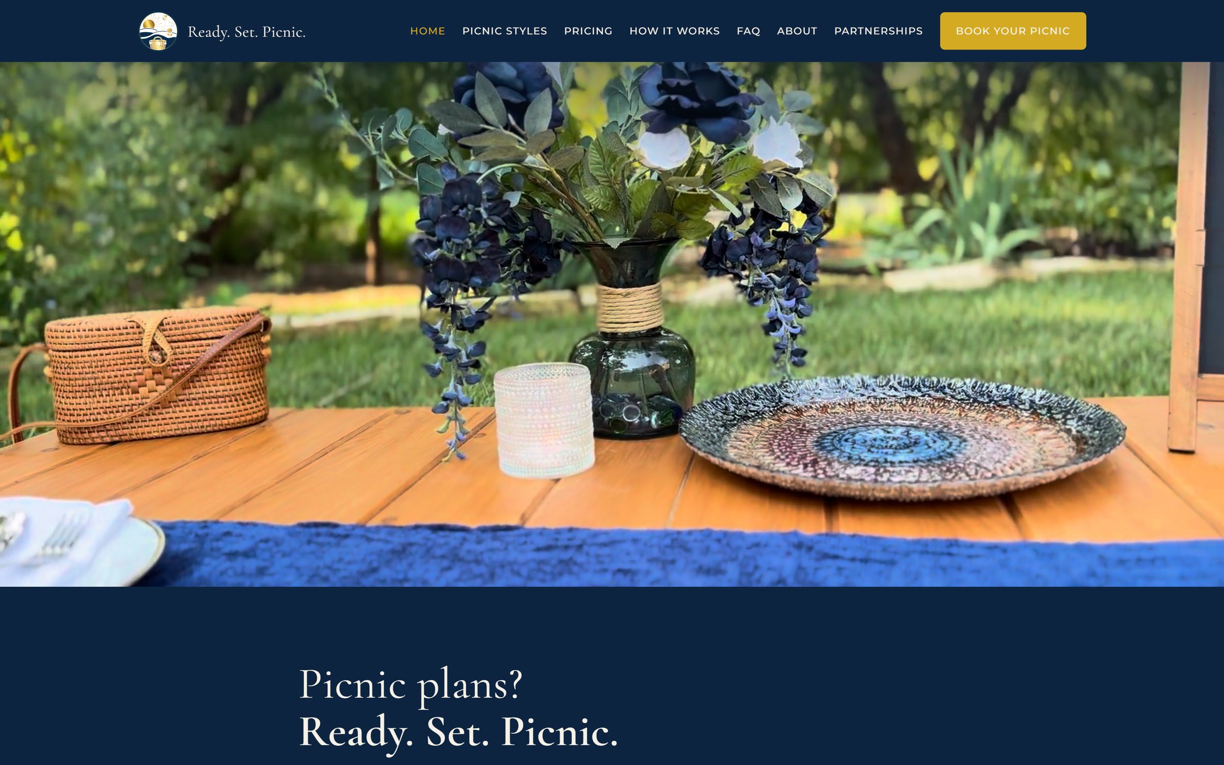
Home page. The offer and the price, both above the fold.
Brand Development
Logo, visual identity & art direction
Website Design
Strategy, copy, UX & build
Photo + Video
Photography, videography & launch content
This moose was hiding in the logistics.
Every sighting gets the same four questions, written down the way we'd write them in the journal.
- Scope
- Brand development, website design, photography and videography
- Sector
- Styled picnic rentals
- Habitat
- Wichita and South Central Kansas
- Platform
- Custom build

Challenge
A new styled-picnic rental business entering a category most people only know from other people's photographs. The pictures always look effortless. What nobody can tell from a photograph is whether booking one turns into a project: what you get, what it costs, and how much of the day you spend hauling things.

Discovery
The product isn't the styling. It's permission to stop planning. The business had already solved the hard part, that you don't buy, store, or haul any of it, and that sentence was doing more work than any photograph on the page. It wasn't leading anything.

Solution
Navy and gold, built around a pin-drop mark holding a sunrise and a picnic basket, because the whole promise is that the picnic arrives somewhere. The site opens on Picnic plans? Ready. Set. Picnic. and puts the price in the first screen. Five named Picnic Styles give people something to choose instead of something to design, and How It Works runs in order on the home page rather than hiding on its own tab.

Outcome
Someone can arrive knowing nothing about styled picnics and leave the home page knowing what they get, what it costs, and what they have to do. The five named styles also gave the business a vocabulary it can keep building on, one new style at a time.
Drawn to travel.
A pin drop holding a sunrise, a sunflower and a picnic basket. The circle works on its own at any size. The full lockup carries the name where the name has to do the work.


Stills sell the look. Video sells the evening.
Shot and cut for the site and for social, in the shapes each one actually needs. Wide for the header, vertical for the feed.
The photography is the product.
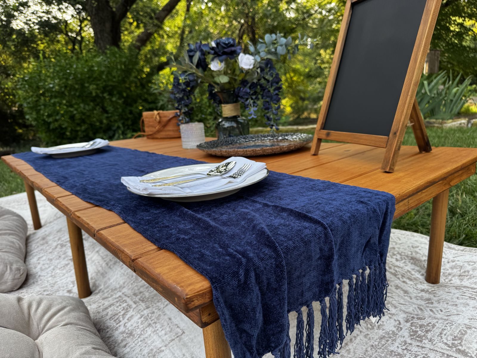
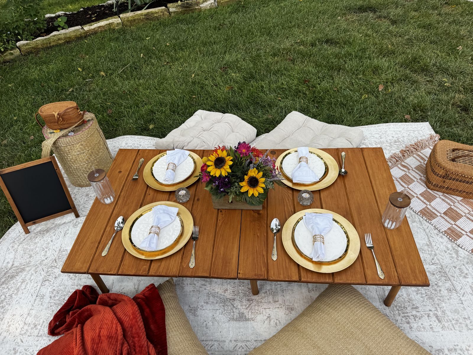
Nobody books a styled picnic off a description. Every setup on the site was styled, shot and edited by us, which is also why the five Picnic Styles could be named at all. You cannot sell a look you have no picture of.
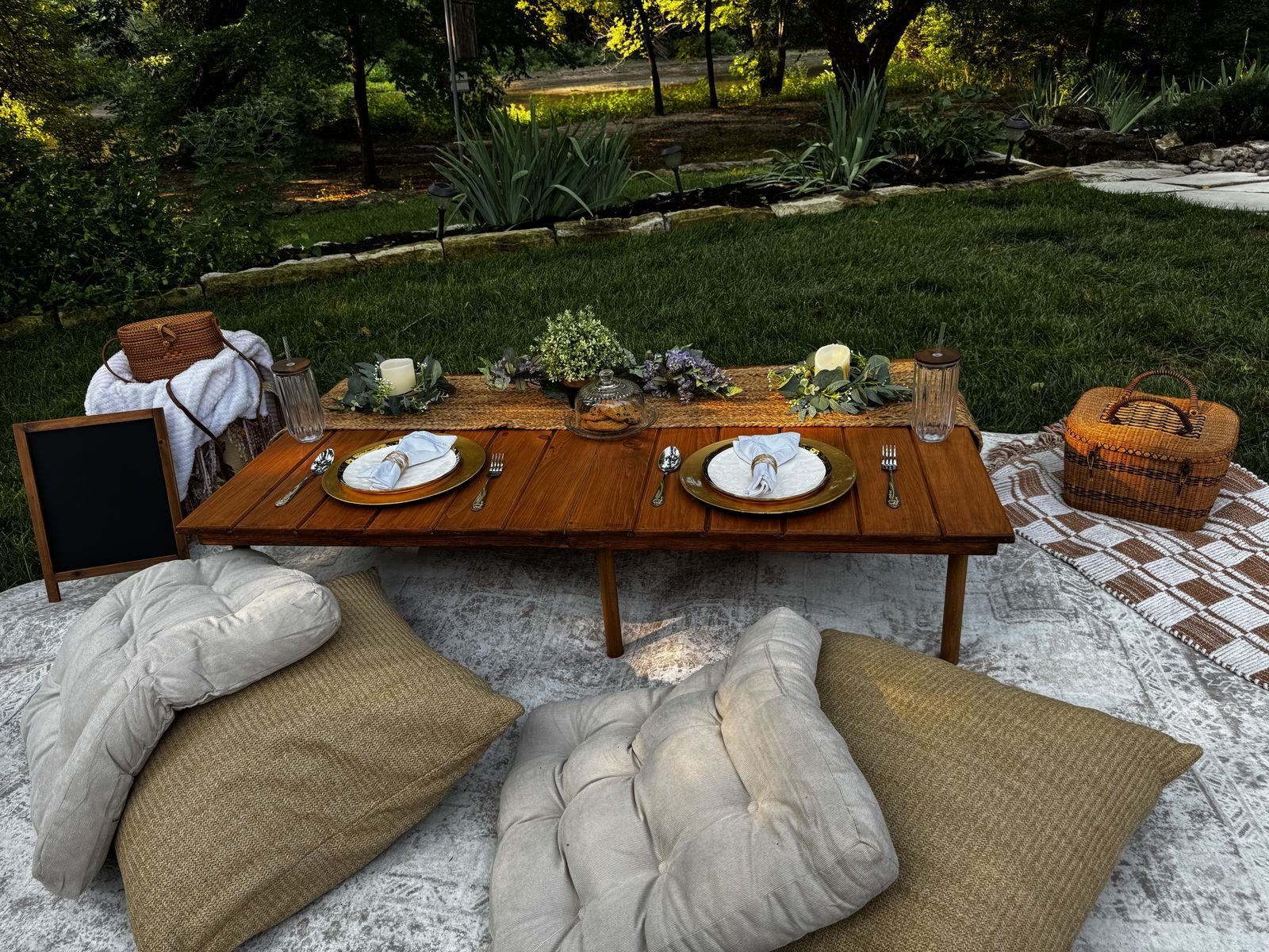
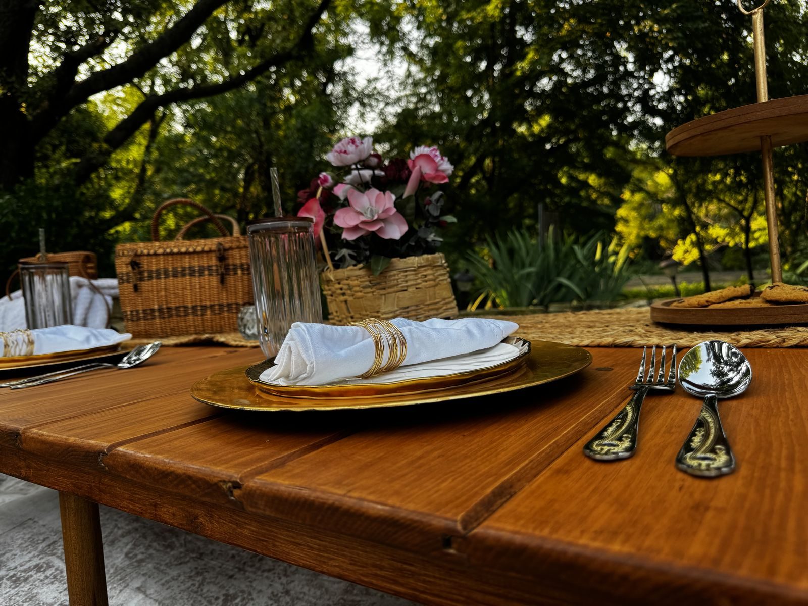
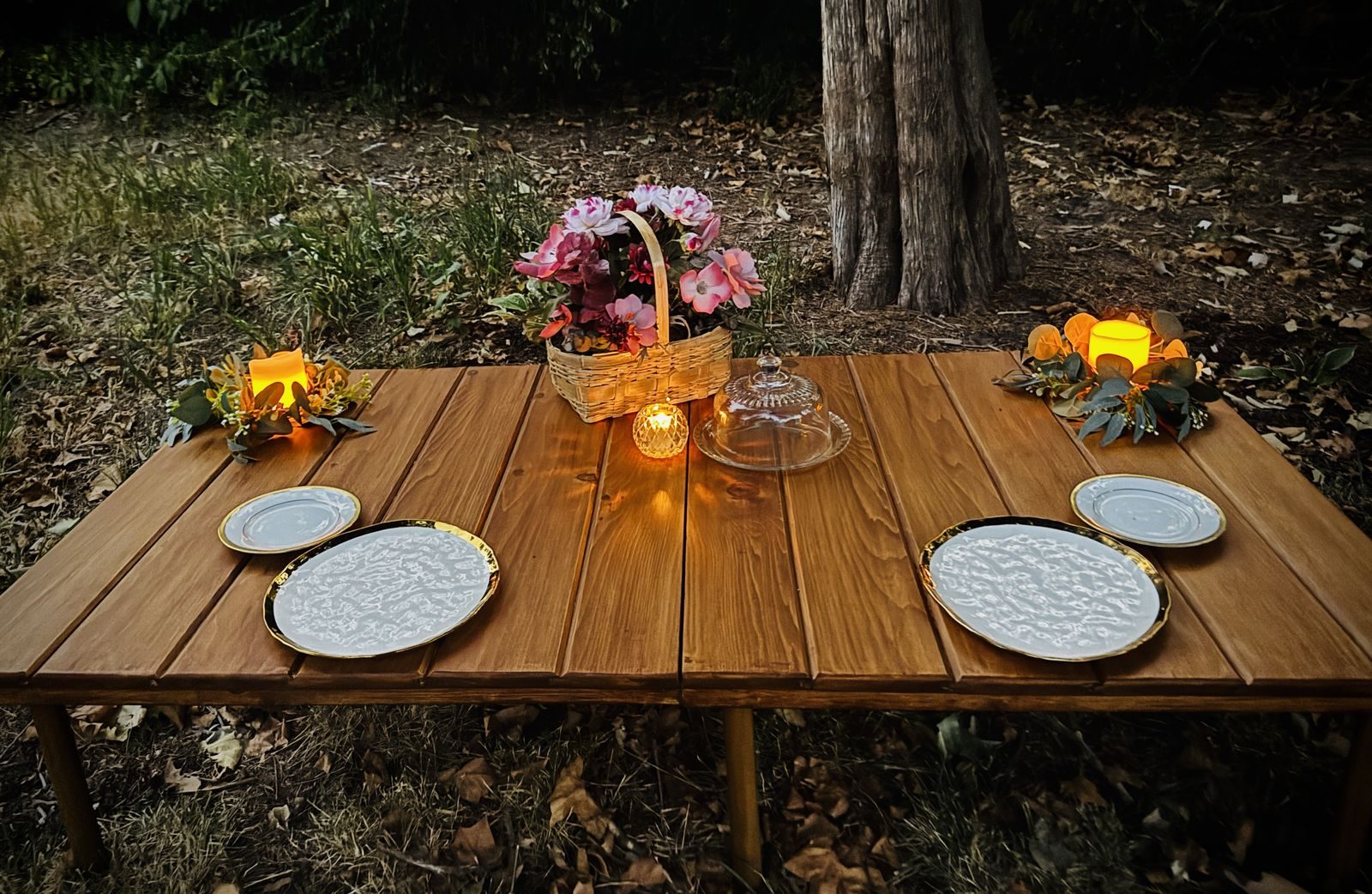
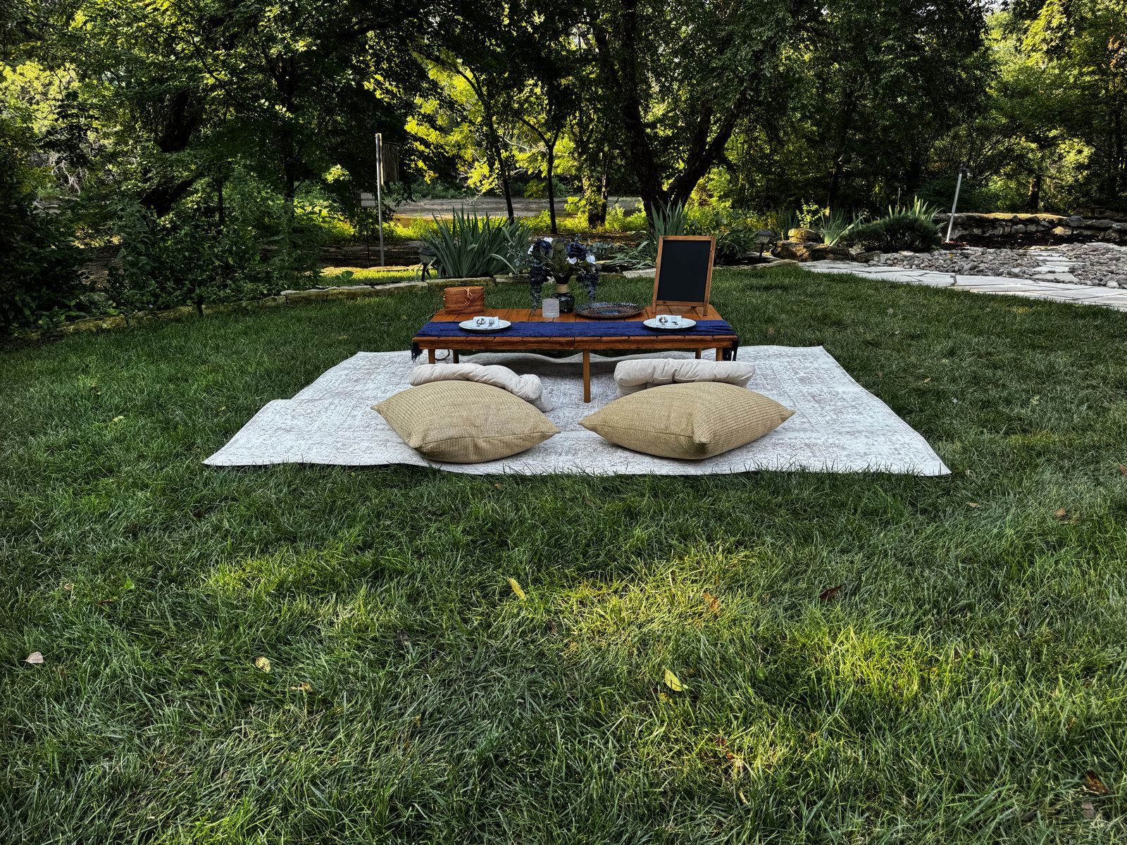
Five styles instead of a blank page
Naming things is design work. Midnight Garden, Sunflower Spring, Lavender Sage, Blushing Garden and Champagne Garden each got a palette, a list of occasions, and a photograph, which turned an open-ended custom order into five things a person can point at. Custom is still there for anyone who wants it, but nobody is made to start from nothing. It also gave the business a structure it can keep extending, one named style at a time, without a redesign.
The boring parts got the good real estate
Most sites in this category hide the practical answers on an inside page and lead with photography. We put the rental window, the return time, the service area and everything in the box on the home page, in order, because those are the questions that actually stop someone from booking. The photography still does its job. It just is not carrying the whole decision on its own.
Nobody wants a project. They want a picnic.From the journal margin